Understanding the Performance Graph
The Performance Graph shows your ECG interpretation performance over time for your current results set.
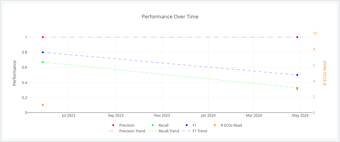
Time is shown across the horizontal axis. Performance measures are shown on the left vertical axis, while the number of ECGs interpreted on a particular day is shown on the right vertical axis.
The three performance measures are shown as follows: Precision is shown as red dots, Recall is shown green dots, and the F1 Statistic is shown as blue dots. Trend lines for these three measures are shown in the same colors. The number of ECGs is shown in orange diamonds.
Hovering the mouse over any of the dots and diamonds in the graph will show the specific value for the dot or diamond and the day the value was obtained.
Clicking and dragging the mouse over the graph region will zoom in on the region selected. Double-clicking in the graph region will zoom back out.